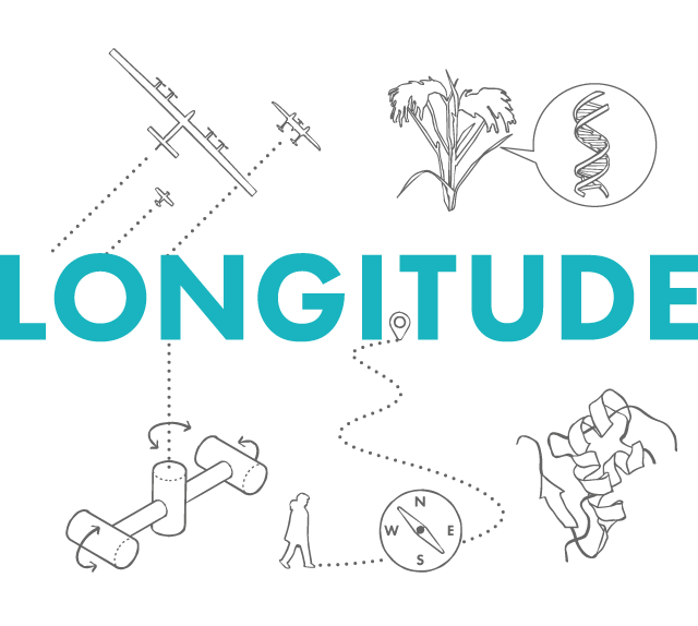
In February 2014 we started work on the Longitude Prize. How we approached this project and what we learned along the way is the topic of the following posts:
Antibiotics, Dementia, Flight, Food, Paralysis, and Water. Our first task on the Longitude project was to map out the main barriers to innovation within each of these areas and understand what are some of the most promising routes towards a solution. Given the short timeframes of the project, how could we best engage with the expert community to build this understanding?
At Science Practice, we take a design-led approach to research. Plainly put, rather than asking experts to tell us their opinion on a topic, we present them with a specific proposal and seek their response to it. We often refer to this proposal as ‘research stimulus’. For this first phase of the Longitude project the research stimulus took the form of a map.
As with a map of a physical landscape, ‘challenge maps’ - as we started calling them, described the barriers to be overcome or circumnavigated, promising pathways to a goal, and the milestones along the way. The maps aimed to translate the scientific, technical, and social factors surrounding a challenge area into an imagined landscape.
Before we started work on Longitude 2014, we decided to see if we could make a map for the original Longitude Act of 1714:
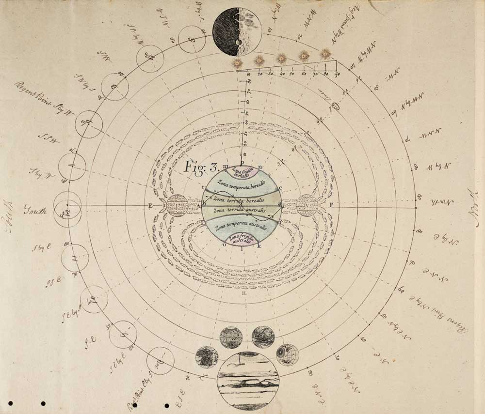
We put together this map to illustrate some of the potential solutions to the Longitude problem from the perspective of a natural philosopher in 1714. Elements of the map have been sourced from the fascinating collection of Papers of the Board of Longitude archived at the University of Cambridge.
The main aim of challenge maps wasn’t to achieve accuracy, but to become a starting point for conversations with experts. We wanted them to be engaged in the research process, explore alternative solutions, and play an active role in shaping the landscape defining each challenge area.
Challenge Maps in Practice
One of the first things we learned was that representing a challenge topic as a two dimensional map didn’t always work. Some topics were simply too complex, especially when cultural and political factors needed to be represented. The Food and Dementia topics were certainly the most difficult. For the Water, Flight, Paralysis, and Food challenge topics, however, the approach seemed quite natural.
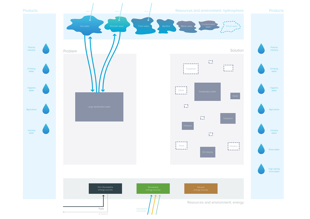
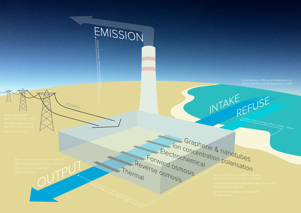
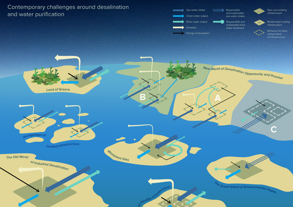
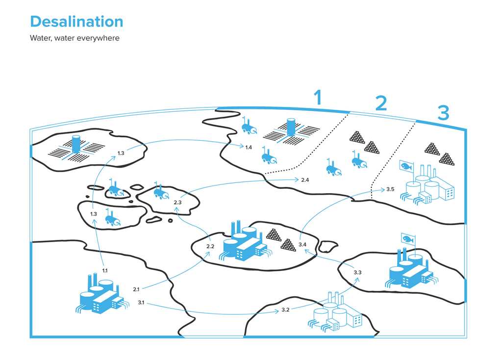
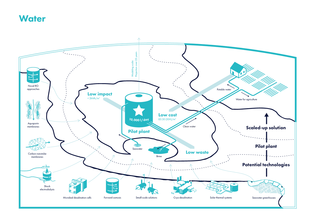
Successive iterations of the challenge map for the Water prize
Used as research stimulus in interviews with experts, the maps triggered different responses. While some experts found them very helpful and used them to build their arguments, others criticised or simply ignored them. We tried to make sense of each of these reactions to further develop our understanding of the six challenge areas.
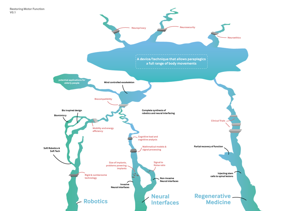
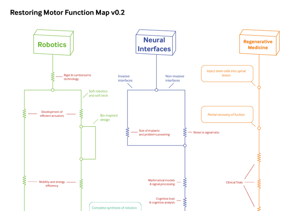
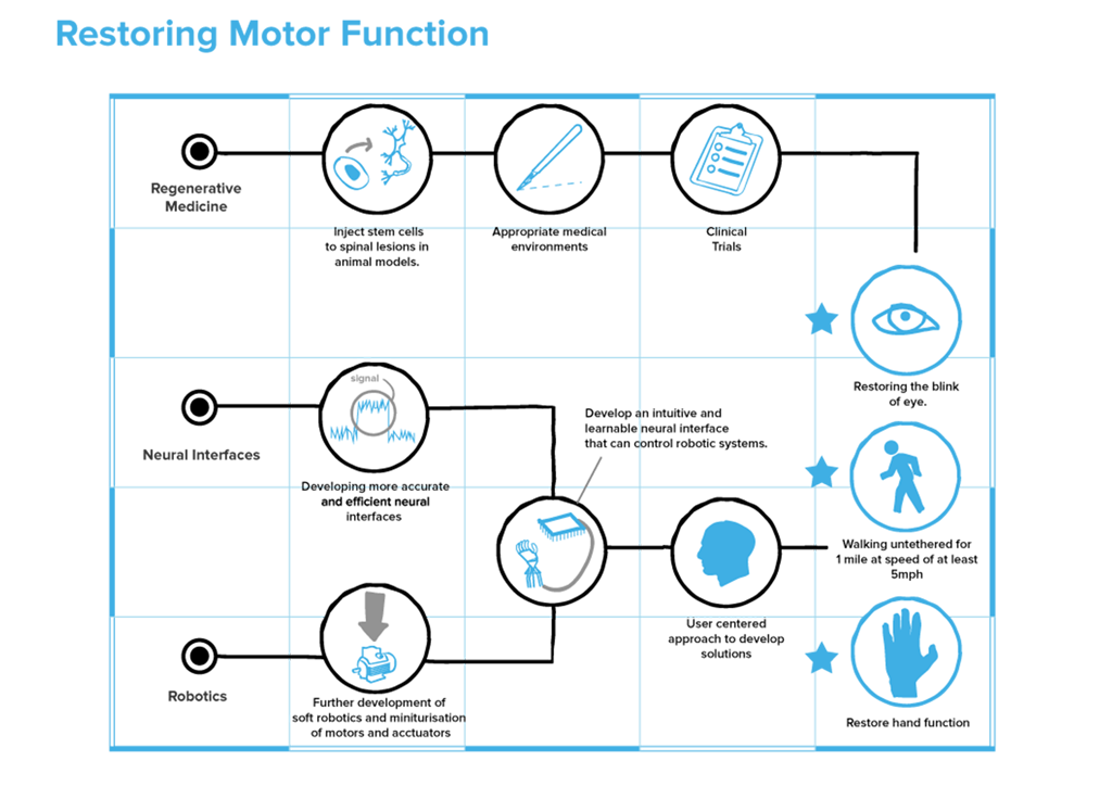
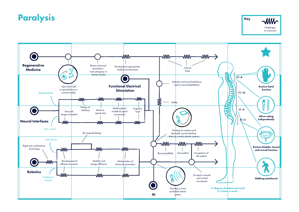
Successive iterations of the challenge map for the Paralysis prize
As well as helping us develop our factual understanding of the challenge topics, we would often receive some surprisingly nuanced feedback. In early drafts for the Antibiotics challenge map we represented the history of infection control as a war between two opposing armies: microbes and humanity. This war metaphor appears regularly in the literature and popular press so it seemed sensible to appropriate it for our challenge.
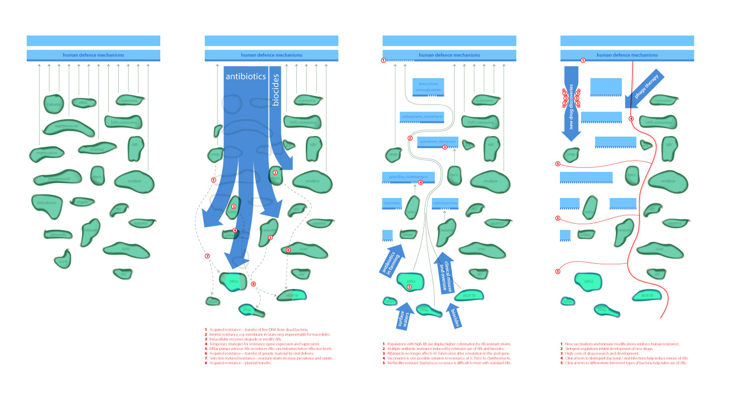
First version of the challenge map for the Antibiotics prize
However, when presenting this map to experts they reacted strongly against it, arguing (rightly) that the war metaphor plays a role in shaping people’s attitudes towards bacterial infections and helps to propagate the irresponsible use of antibiotics.
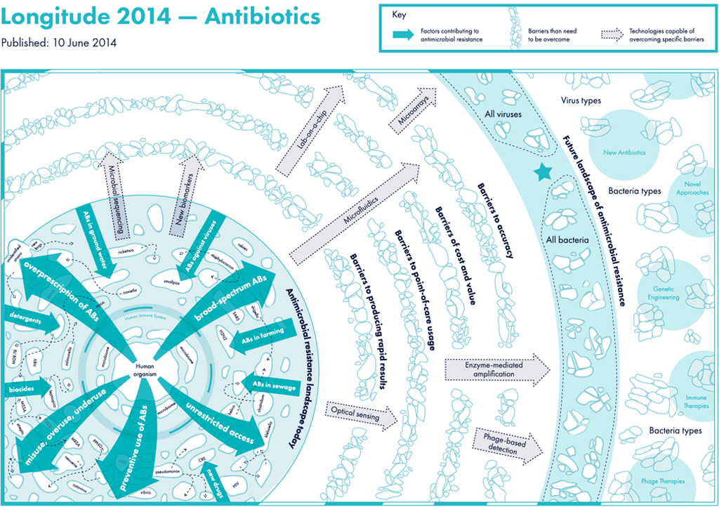
Final version of the challenge map for the Antibiotics prize
Maps allowed us to set a frame around the challenge area without actually imposing any direct constraints on what could be included. Elements of the map, such as the relative position of objects or landmark features such as bridges or rivers, became signifiers for barriers or opportunities for innovation in the challenge area. By encouraging interviewees to edit the maps we not only received information about potential fields or technologies which could generate solutions, but also contextual information about the likelihood of their success or ability to be attained within the lifetime of the Longitude Prize.
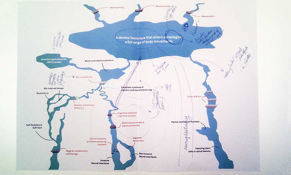
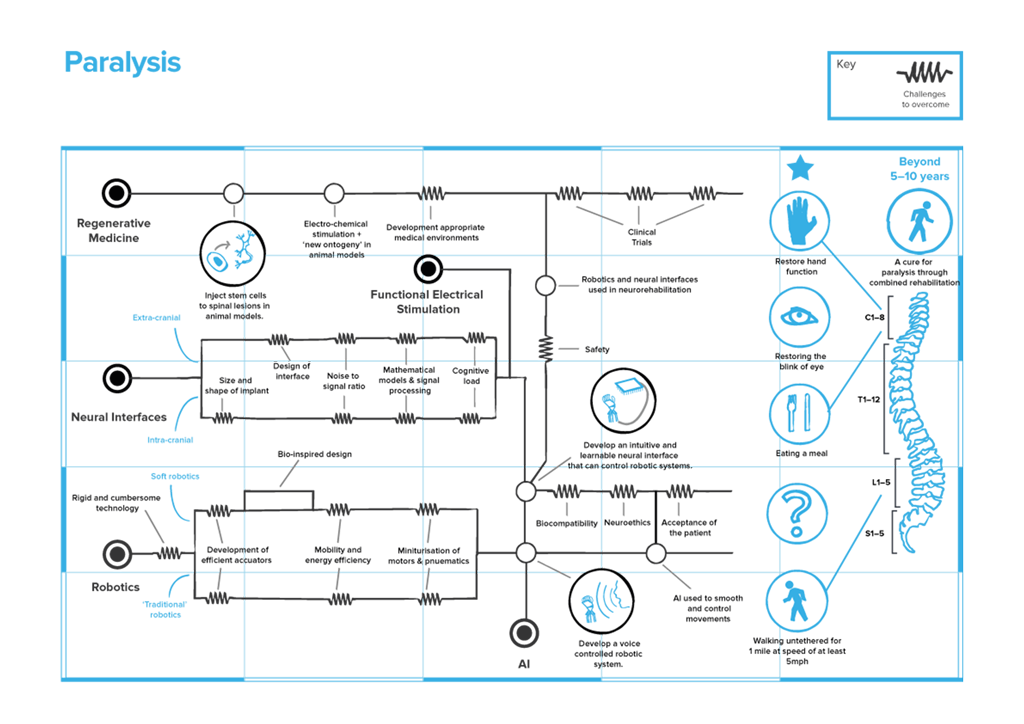
An annotated challenge map for the Paralysis prize following an interview with an expert in the field
Synthesising Expertise
Seven weeks and 60 interviews later, we ended up with six very different challenge maps. While some developed along the initially defined structures, others were redrawn into completely different shapes as our understanding of the challenge areas changed. Some maps were quite clear and concise, others were still rather abstract or cluttered - making plain the issues in need of further research.
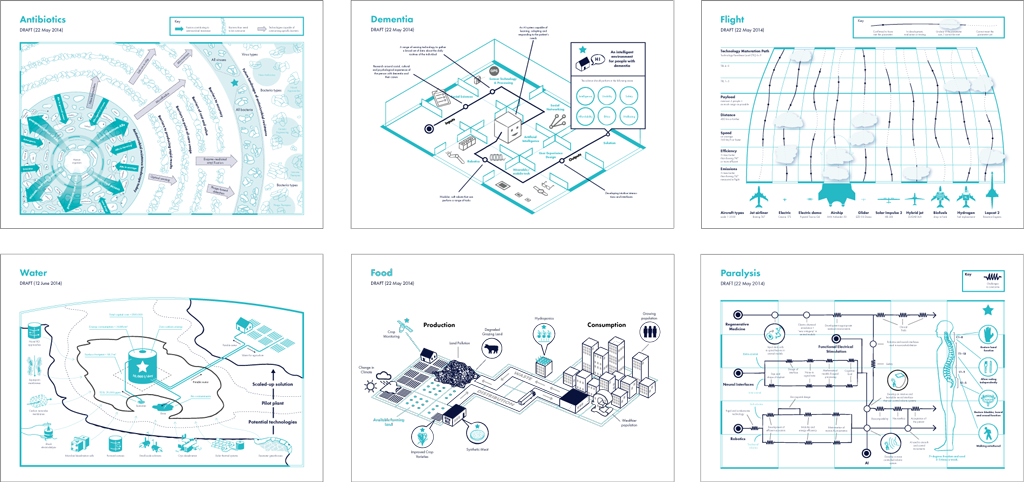
All six Longitude challenge maps
Although the maps themselves evolved through this process, they are actually more of a byproduct. As research stimulus, they enabled us to have guided yet flexible conversations with experts, encourage them to explore novel technologies, and suggest potential pathways to solutions.
The next step for us was to build on these conversations and start shaping the basic structure of the six challenge prizes. This became the challenge prototyping phase of the Longitude project, which we will discuss in our next post.