Opening the black box
Building trust in algorithms through visualisation
The challenge: Help users build trust in the ranking of identified genetic variants.
Our solution: Interactive data visualisations to expose the mechanism of the ranking algorithm.
As a result: Users are able to work with trust and confidence in variant ranking.
A genomics startup approached us with an effective bioinformatics tool for identifying damaging genetic changes in data — but no user interface to allow people to use it.
We worked with their product and science teams to design workflows and interfaces for an end-to-end user experience of the platform.
This case study focuses on one of the features that we designed for the platform — a data visualisation to explain and build confidence in underlying algorithms.
Variant in a Haystack
Genetic variants are often displayed in tables. These cope well with the average 20,000 variants that are produced in a sequencing experiment, but can be very time-consuming to manipulate and work with.
The startup had developed an effective algorithmic method to rank variants according to the probablility that they were disease causing, helping in genetic investigations by prioritising those variants in the table that are most likely pathogenic.
However, to win the trust of the geneticists, the ranking algorithm had to be not only functional, but also transparent. We took this challenge to design a solution that would provide additional insight into the ordering of the table, helping users to understand the logic behind the algorithm and improving usability for clinical settings.
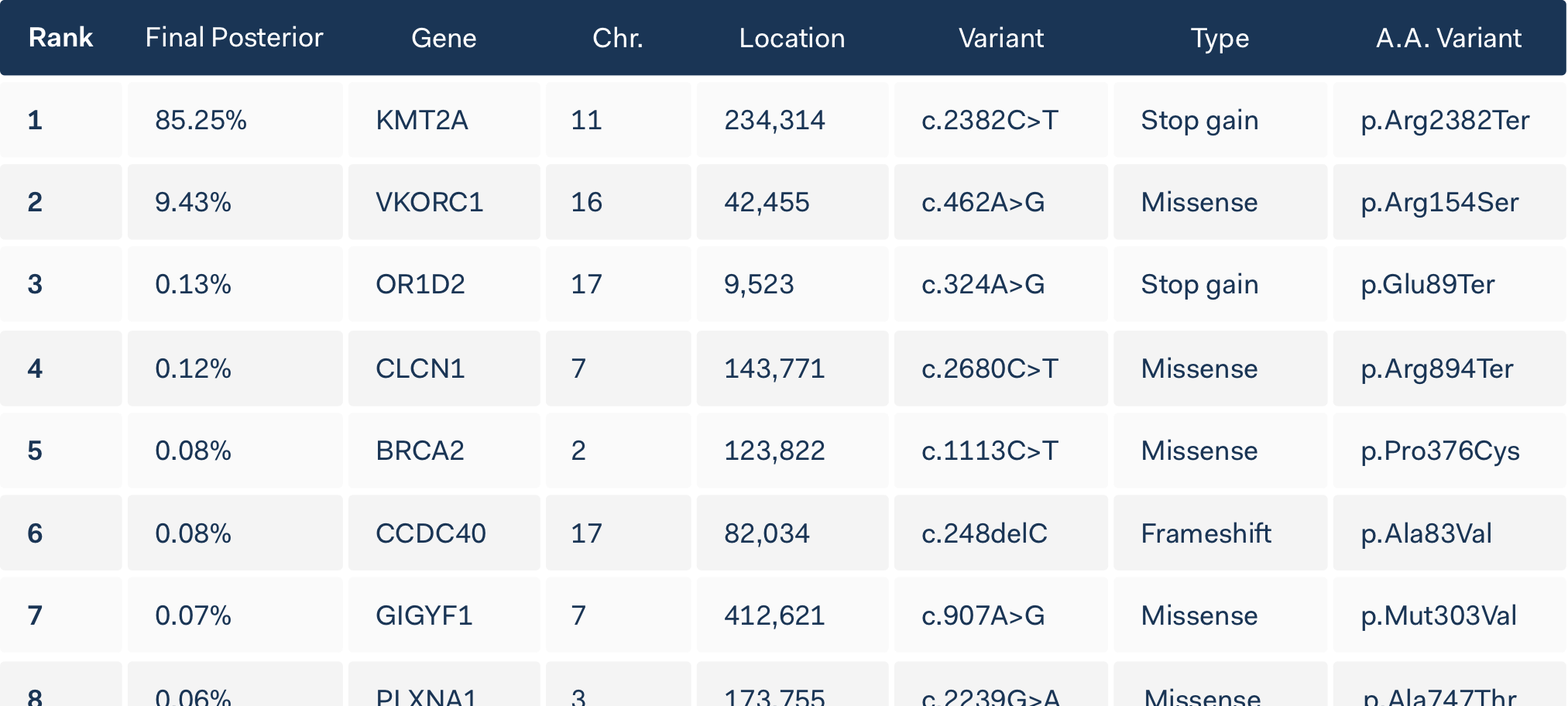
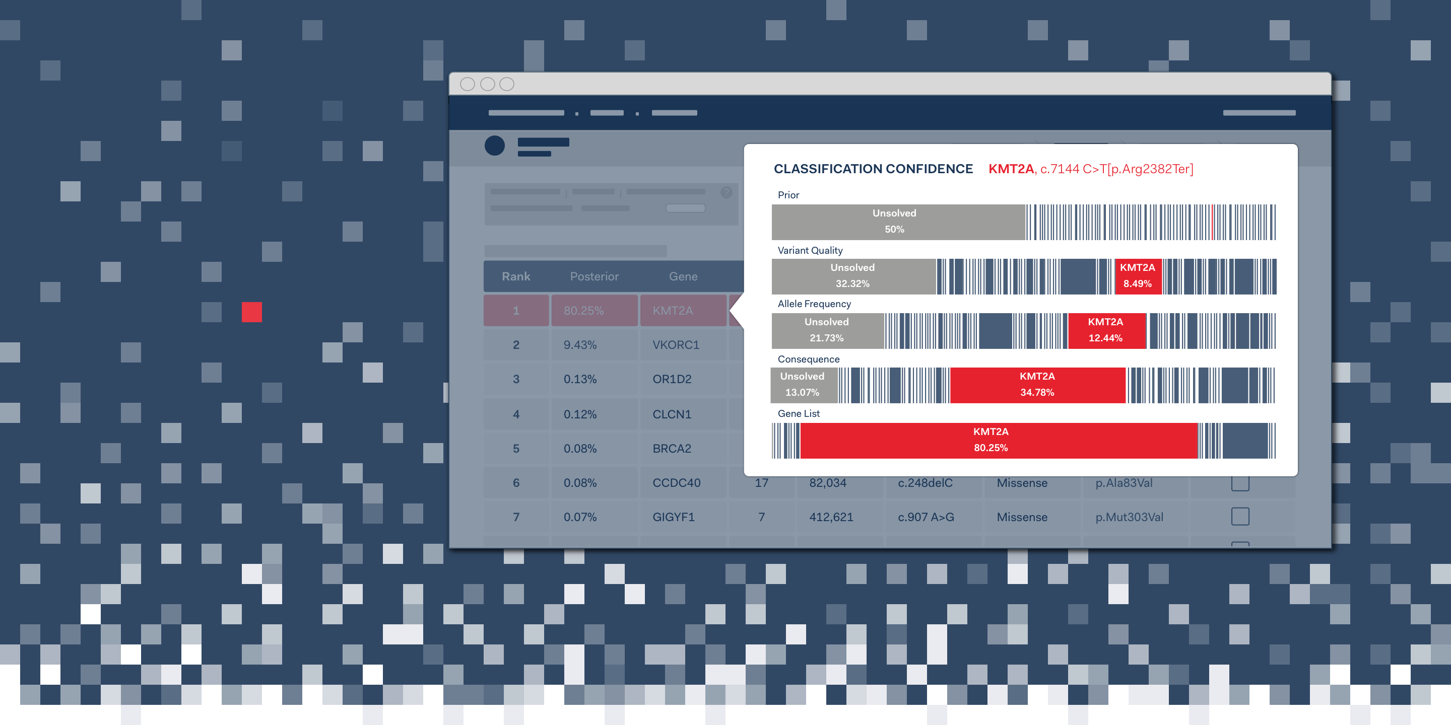
The output of the ranking algorithm was the Final Posterior value calculated for each variant in the table. The percentage indicates the probability of each variant to be disease causing.
What’s under the hood?
One of the most important design challenges for scientific software is finding an effective way to explain the underlying principles that govern how the software works.
It is criticial not to overwhelm users with option settings and technical detail, while still allowing people to dig deeper when they need to.
In this case the algorithm works by applying a series of statistical assessments to determine the ranking of variants. The output is an ordered list of variants, with a confidence score indicating the probability that it could be pathogenic. We needed to help users understand this process, building trust in the logic of the software.

Visualising Confidence
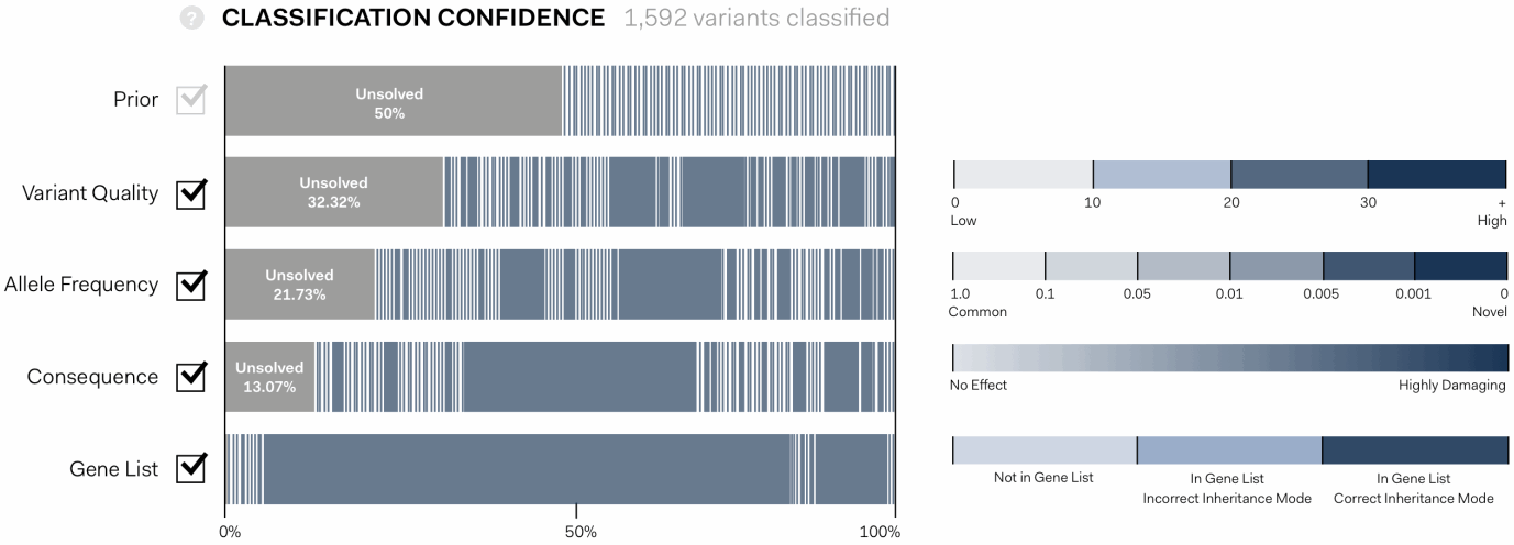
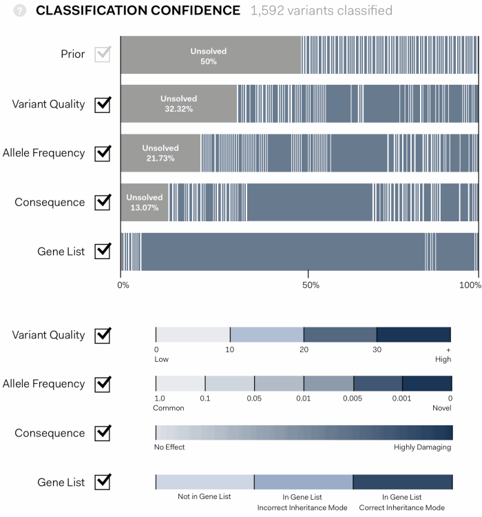
The solution we designed is an interactive, graphic interface. It shows the path of genetic variants from equal probability of being disease causing at first pass (Prior), to a final assessment of the variants that have been identified in an experiment.
In the visualisation below each coloured bar represents a single variant. The width proportionally increases or decreases according to the confidence that a variant is disease causing as each assessment pass is applied: Variant Quality, Allele Frequency, Consequence, Gene List.
the algorithim is explained further, showing individual values contributing the statistical assessment in the context of maximum and minimum values possible for each pass.
This approach gave users the opportunity to interact with the tool in a visually intuitive way, giving a fuller understanding of its logic and providing options to manipulate its working.
Each statistical pass can be toggled on or off, allowing users to determine the conseqeunce, and to see those that might be having an unusual impact.
Importantly, it clearly indicates cases in which there is a strong signal of a specific variant being responsible for disease, and cases where many variants are similarly ranked.

This project highlights the power of visualisation for scientific software. Opening up the black box of the algorithm in this way builds trust for users, allowing them to compare the logic of the tool with their own understanding. Adding interactivity transforms it into an intuitive and engaging way to manipulate the software, encouraging the use of the tool for discovery.
For the startup this work was invaluable in describing the benefits of their software to newcomers.